I remember as a child I was fascinated when taught about refraction of light through a prism. The colors breaking down to form a rainbow was simply enthralling. Even as adults, we associate colors with everything – red for love or anger, yellow for happiness, black for fear... Why am I talking about colors? You will be surprised!
There is a new strategy on using colors to attract potential customers. Yes, you read it right – the sheer impact or effect a color has on your brain can steer you to either buy or spurn away from a product. Color Psychology is a trend followed by most content marketers to gain customers. It is an area of research that peeks into the world of colors and how they influence customer behavior and decision making. Different colors impact the mind differently – in perception.
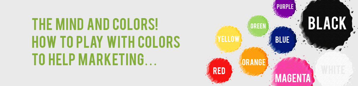
Let us take some common colors and see what emotions they cue up in a buyer.
RED – the fiery bright color stimulates powerful emotions (can be negative or positive), creates a sense of urgency associated with movement / excitement.
Mainly, it encourages appetite – explains why the most popular fast-food joints have red splashed all over their names / logos like Coca cola, Kellogg's, KFC and more. One may also consider looking at Levis, Pinterest, Canon…
ORANGE – Associated with sun, orange is seemingly warm, cheerful and promoting optimism. Though considered fun it can also show caution. Suitable for corporate brands or inducing impulsive shoppers! Think of Amazon, Harley Davidson or even Mastercard!
YELLOW – Another warm color encouraging happiness and creativity. Though some shades of this color may call for caution or fear even, it is generally considered a ‘fun’ color. Can be powerful when positioned against a darker color attracting customers instantly. Nikon, McDonalds, IMDB, DHL and many more come to mind…
GREEN – Associated with nature, it brings a sense of tranquility and relaxation. It represents ‘life’ to us and we connect it with our health, growth and hope. Great for brands looking at promoting health and organic ways of life! Some popular brands include Animal Planet, Whole Foods Market, Perrier, Xbox... Psst, have you ever wondered why our site (JAT) is green? Let us know what you think?
BLUE – Reliable is the word that comes to mind when one says Blue. It provides a sense of security, stimulates productivity yet makes one feel calm. Brands looking to seal in loyalty from customer are likely to go for this color! American Express, Nivea, Ford, Dell – reliability at its best…
PURPLE – The soft velvetiness of this color exudes royalty and commands respect. It shows sophistication and speaks of imagination. Often products that want to enhance beauty or brands that are considered prestigious! Think of Cadbury, Yahoo, Taco Bell and more for this color...
MAGENTA – A very feminine color needless to say. Used in the innovative industry to break the mold or stand apart brands, this color is comforting and hopeful. Bourjois Paris, Barbie, Victoria’s Secret are some that strike a chord for this color.
BLACK – Authority, power, elegance, strength are just few words that arise out of this color. Intelligent and fashion brands often use this color to spell out their power and sophistication. Powerful brands such as Nike, Hugo Boss, Puma, Chanel and many others take the lead.
WHITE – Associates with innocence and purity, this color gives a neutral sense of thinking. Sleek brands of fashion and luxury brands tend to use white to augment their pristine quality. Well known names like Adidas, ZARA, Tesla, Lexus, Burberry and more are what pops up with this color.
This is just a simple way to look at how colors influence the mind. But mind you, there are few things to keep in mind before you design something to enrapture customers -
- The tones, tints and shades of each color have differed effects from the main color
- The colors influence genders differently when associated with certain brands. Men and women react differently to colors – that’s a big topic in itself! (Would you be interested to know more, tell us, we will write on it)
- It matters on how you place the colors – contrasting shades or shade card of the same color – giving out distinct messages.
Well, we have grown beyond the days where a child could just pick up a favorite colored crayon and splatter the pages with it. It is now a well thought-after strategy to allure customers into your business domain.
Let me know if you have a colorful story to add to the above - would love to paint... err read it!!!